← All insights
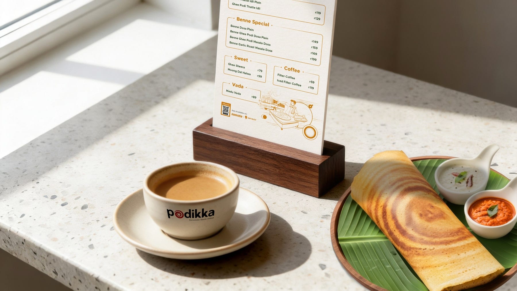
Podikka menu in a wooden stand on a café table, beside a cup of coffee and a dosa, designed by Grit Fox

Is Your Restaurant Menu Losing You Orders? Common Menu Design Problems and How to Fix Them

By Grit FoxOctober 202612 min read

  • Cafés & Restaurants
  • Identity
  • Strategy
  • Packaging

Yes, a menu can lose you orders. When it has too many items, no hierarchy, vague descriptions or categories that don’t match how people decide, customers choose slowly, retreat to the safest dish or leave. The fix is to treat the menu as part of the restaurant’s brand: fewer and clearer choices, a layout that guides the eye, and descriptions that say something specific.

Be wary of anyone who promises a fixed lift from a menu layout. No layout reliably adds a set percentage to sales, and results depend on pricing, food, footfall and how the restaurant is run. What good menu design does is remove friction between a hungry customer and a decision.

This post covers the problems that come up most often in printed, digital and QR menus, the difference between menu engineering and menu design, how to keep menus consistent across outlets, and a menu audit you can run this week. If your restaurant has a wider problem getting customers, start with our post on why restaurants don’t get customers.

Why does a menu lose orders?

Because it makes deciding harder than leaving. A menu does three jobs: it tells a stranger what kind of place this is, it helps them choose, and it signals what things cost and why they’re worth it. When it fails the second job, the customer does the easy thing. They order the dish they already know, order the cheapest one, or hand the phone back. On a delivery app they scroll away, and you never see it happen.

Do too many menu items overwhelm customers?

Sometimes, and the research is less tidy than the popular story. A 2010 meta-analysis of 50 experiments found the average “choice overload” effect was virtually zero, though results varied widely between studies (Scheibehenne, Greifeneder and Todd, Journal of Consumer Research). So distrust anyone who gives you a magic number of items.

What you can control is how much sorting you ask the customer to do. A long menu with no signal about what to try, read on a phone in the middle of a conversation, hands a stranger all of it. Signature dishes, a sensible number of categories and fewer near-duplicates (six paneer gravies that differ by one ingredient) shrink the job. A long menu also costs the kitchen: more prep, more stock, slower service, more chances to be inconsistent. Cut what rarely sells and adds nothing to the idea of the restaurant.

How does menu hierarchy guide attention?

Hierarchy tells the eye where to start and what to read next. Without it every line has the same weight, the customer reads top to bottom, and whatever’s listed first wins by default.

Build three levels and keep them: category headings that orient, dish names that carry the decision, and descriptions in a lighter weight that support it. Mark one or two signature dishes per section with a subtle device rather than a loud box. Give prices a consistent, quiet position unless price is your story. White space does as much work as type: group what belongs together and leave room around what you want noticed.

If the menu is bilingual, decide which language leads. Two full sets of text at equal weight doubles the clutter.

How do you write dish descriptions that sell without overselling?

Say what it is, what makes it distinct and what to expect, in one or two lines. Compare these two (an illustrative rewrite):

  • Before: “Paneer Butter Masala. Tasty paneer in rich gravy.”
  • After: “Paneer Butter Masala. Soft paneer cubes in a slow-cooked tomato and butter gravy, finished with kasuri methi. Mild and creamy. Serves one with two rotis.”

The second gives the ingredient, the method, the flavour and the portion. Add what Indian customers often check before ordering: veg or non-veg, spice level, Jain options, half or full portion. Skip words every menu uses (“delicious”, “authentic”, “famous”) and claims you can’t back, such as “best in the city”. Descriptions are also where your brand speaks most often, so they should sound like you. That’s a job for verbal identity, which we touch on in our post on brand story.

How should you organise menu categories for easier decisions?

Organise by how customers decide, not by how the kitchen is arranged. Starters, mains, breads and rice follow stations. Customers think in occasions and limits: a quick lunch, something to share, something light, under ₹300.

Pick the frame your customers already use. A café might run coffee, cold drinks, bakes and all-day breakfast. A QSR might put combos first, then singles, then sides. A cloud kitchen might lead with a short list of hero meals. Put the categories you most want to sell near the top, keep the count to what a screen can show without endless scrolling, and name them in words customers would say.

What are the common mistakes in printed, digital and QR menus?

Each format fails in its own way.

Printed menus: type too small for dim light, laminated pages with prices corrected by sticker or marker, dense pages with no breathing room, and photography that doesn’t match what’s served.

Digital menus (apps and websites): a PDF that has to be pinched and zoomed, photo styles that change from item to item, names cut off in lists, and descriptions missing entirely.

QR menus: a code that opens a slow PDF, text unreadable without zooming, no way to jump between categories, a tiny or low-contrast code, codes that still point to last season’s menu, and no printed fallback for guests who’d rather not scan.

Test every menu the way a customer would: a mid-range Android phone on mobile data, in a dimly lit room, one-handed. If it’s awkward for you, it’s worse for a hungry family of four.

How do typography, spacing, photography and layout affect readability?

They decide whether the menu gets read at all. Choose a type size you can read at arm’s length in the room’s real lighting, and test it there, not on a screen. Use no more than two typefaces: one for headings and dish names, one for descriptions. Keep strong contrast between text and background, including on coloured paper and in dark digital themes. Use spacing to group items and keep alignment consistent so prices are easy to find.

Photography earns its place only where it helps a decision. Use it for hero items or unfamiliar dishes, shoot it in one consistent style, and make sure what reaches the table looks like the picture. A gap between menu photo and plate erodes trust.

How should a menu reflect your restaurant’s positioning and brand identity?

The menu is the most-read piece of your restaurant brand identity, so it has to look and sound like the rest of it. A menu built from a stock template tells customers you’re like everyone else, whatever the signboard says. Positioning should show in the format, the paper or screen, how prices are presented and how the copy sounds. A premium tasting-menu restaurant and a quick-lunch thali counter shouldn’t share a menu design.

Format changes the job:

FormatWhat the menu has to doWatch for
Café or coffee shopSupport a quick, repeatable choice and an add-onDrink and bake categories that blur; photos that don’t match the cup
QSR or fast-food outletBe read at the counter or board in secondsCombos that confuse; board text too small for the queue
Cloud kitchenBe the entire storefront on an appOver-long lists; no hero meals; photos that vary item to item
Full-service restaurantSet the tone and guide a longer decisionPages that feel templated; copy that doesn’t match the positioning

Brand identity work covers all of this, so menus, signage, packaging and social read as one business. Our post on logo versus brand identity explains the wider system.

How do you keep menus consistent across multiple outlets?

Build one master system and control the zones that change. Without it, outlet three’s manager gets the menu printed locally with a different font, a different order and last season’s prices.

  1. Create a master template with locked zones (logo, colours, typefaces, category structure, section headings) and editable zones (local prices, local items, offers).
  2. Name dishes and categories identically everywhere: the POS, the delivery apps, the printed menu and the QR.
  3. Publish a short photography and copy guide so new items match old ones.
  4. Give one person or team the job of approving every change before it goes to print or live.
  5. Point every QR code to one source of truth, so a price change is made once.

Consistency matters more as you grow. It’s what lets a customer recognise outlet four after eating at outlet one.

How do you audit a restaurant menu?

Go through nine areas as a stranger would, in the room where the menu is used. Score each one yes, partly or no. As a rule of thumb (ours, not a study), two or more “no” answers are a reason to redesign rather than tweak.

AreaAskIf the answer is no
ReadabilityCan a guest read it at arm’s length in the room’s real lighting, with strong contrast?Increase size, contrast and spacing; cut typefaces to two
HierarchyDoes the eye go to categories, then signature dishes, then details?Re-weight type; mark one or two signature items per section
LengthCan each category be scanned without effort, with near-duplicates removed?Cut items that rarely sell or overlap with others
DescriptionsDoes each one give ingredient, method or flavour, and portion, with veg or non-veg and spice level marked?Rewrite in one or two specific lines
CategoriesDo the headings match how customers decide?Reorganise by occasion or need, not kitchen station
Brand fitWith the name covered, would a stranger know it’s your menu?Align type, colour, voice and format with the identity
PhotographyAre photos consistent and true to the plate?Reshoot hero items; drop photos that mislead
Digital useDoes it open fast on a mid-range phone on mobile data, with category jumps and no pinch-zoom?Replace PDFs with a mobile-first page or an optimised file
ConsistencyAre names, prices and structure the same across print, apps, QR and outlets?Build a master template and an approval step

What’s the difference between menu engineering and menu design?

Menu engineering decides which items to feature. Menu design decides how the menu looks and reads. Menu engineering, developed by Michael Kasavana and Donald Smith, classifies each item by popularity and contribution margin (selling price minus food cost) into stars, plowhorses, puzzles and dogs, then guides decisions on pricing, promotion and removal (FIU Hospitality Review). Menu design is the visual and verbal communication: layout, hierarchy, typography, photography and copy.

Menu engineeringMenu design
The questionWhich items make money, and which should we push, reprice or cut?How does the menu look and read, and does it help people decide?
InputsSales mix, food cost, contribution marginBrand positioning, customer behaviour, format, readability
OutputItem classification, plus pricing, featuring and removal decisionsLayout, hierarchy, type, imagery, copy and templates
Done byOperators, consultants, POS dataDesigners and writers working from the brand

They work together. Engineering says which items deserve the best position. Design makes those items easy to find and keeps the menu on-brand. We’d run the engineering first and design around the result. Neither guarantees a lift on its own: a handsome menu doesn’t fix margins, and a margin analysis doesn’t make a menu readable.

When should a restaurant hire a restaurant design agency or restaurant branding company?

Hire help when the menu problem is a symptom of something bigger. The usual triggers:

  • You’re opening a second or third outlet, a cloud kitchen or a franchise.
  • You’re relaunching or repositioning.
  • Menus differ from outlet to outlet.
  • The menu has been redesigned more than once and nothing improved.
  • The copy sounds like everyone else’s.
  • Print, app and QR don’t match.

Ask what “restaurant design agency” means in each pitch. Some focus on interiors, some on graphics, some on the brand behind both. Whoever you hire should be able to say who owns the link between menu, signage, packaging and social.

At Grit Fox, our restaurant branding services run as one system: brand strategy, identity design, verbal identity, and packaging and rollout. The menu is where those meet the customer. Whether it’s cafe branding, coffee shop branding, QSR branding, fast food restaurant branding or cloud kitchen branding, the menu has to carry the idea, suit the format and survive being reprinted by a vendor. If your menu is working harder than it should, send it over and we’ll tell you what we’d change.

Frequently asked questions

How do I design a better restaurant menu?

Start with the customer’s decision. Cut near-duplicates, group items by how people choose, build a clear hierarchy, mark a few signature dishes, and write specific descriptions. Then test it on a phone and in the room’s real lighting. Keep the type, colour and voice consistent with the rest of the brand.

What makes a restaurant menu easy to use?

Readable type with strong contrast, categories that match how people decide, a visible hierarchy, short specific descriptions and consistent alignment. On a phone it should load fast and let guests jump between categories. If a first-time guest can find a good choice in under a minute, it’s working.

How does menu design affect customer decisions?

Layout, hierarchy, wording and photography shape what guests notice and how easily they compare options. Good design lowers the effort of choosing. No layout reliably raises sales by a fixed percentage, because results also depend on pricing, food, footfall and service.

What is the difference between menu engineering and menu design?

Menu engineering analyses each item’s popularity and contribution margin to decide what to feature, reprice or remove. Menu design is the layout, hierarchy, typography, imagery and copy that present those items. Engineering sets priorities, and design makes them easy to see and keeps the menu on-brand.

When should a restaurant redesign its menu?

Redesign when you reposition, open new outlets, or change the format, or when guests ask the same questions every time, outlets drift apart, or print, app and QR don’t match. Don’t redesign only because the menu looks old. Start with the problem you’re solving.

How can menu design support restaurant branding?

The menu is one of the most-read parts of the brand, so its type, colour, tone and format should carry your positioning. A menu that looks like a stock template weakens the identity. A menu built from the brand system reinforces it, and survives reprints and new outlets.

How many items should a restaurant menu have?

There’s no universal number. Research on choice overload is mixed, with one 2010 meta-analysis finding an average effect close to zero. A better test is whether a first-time guest can find a good choice quickly. Cut near-duplicates and slow sellers, and make signature dishes easy to spot.