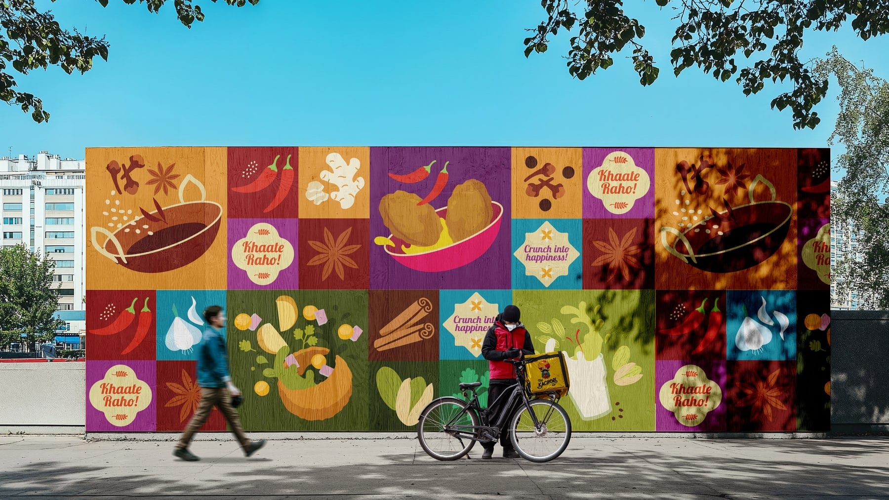
Your Logo Looks Good, but Your Brand Feels Weak. Here’s What Is Missing
A good logo isn’t a brand because a logo is one mark, and a brand is everything people understand, expect and remember about a business. When a brand feels weak behind a good-looking logo, the missing pieces are usually positioning (what you stand for and who you’re for), a point of view, a consistent identity system, and the discipline to apply all three everywhere. Fix those and the logo has something to represent. Skip them and a new logo will be just as weak in a new shape.
This post covers the difference between a logo, a brand identity and branding, what’s usually missing, why strategy comes before design, how to build consistency across packaging, menus, signage, interiors and social, the signs you’ve outgrown your identity, how to choose between a refresh and a rebrand, and how to check that an agency is solving the right problem.
What’s the difference between a logo, brand identity and branding?
A logo is a mark, a brand identity is the system that mark lives in, and branding is the whole job of deciding what the business stands for and expressing it consistently. Each sits inside the next.
| Logo | Brand identity | Branding | |
|---|---|---|---|
| What it is | One mark that identifies the business | The visual and verbal system: logo suite, colour, typography, imagery, graphic language, tone of voice, layouts | The strategy, positioning, identity and execution that shape how people perceive the business |
| The question it answers | Which business is this? | Does everything look and sound like one business? | Why choose this one, and does every touchpoint prove it? |
| Where it lives | Signboard, packaging corner, app icon | Packaging, menus, signage, social, website, uniforms | The whole customer experience |
| What goes wrong | Looks fine, says nothing | Applied differently by every vendor | Never defined, so nothing to apply |
Most businesses that call their brand weak have the first column and not much of the other two.
Why can’t a good logo fix unclear positioning?
Because a logo can’t tell people what to expect. Positioning is the decision about who the business is for, what it’s for and why it’s different. A logo can express that decision. It can’t make it.
Try this. Put a competitor’s logo on your signboard, your packaging or your Instagram header. If nothing else about the experience changes and nobody would notice, the logo was never doing the differentiating. Look at what’s left. If what’s left is generic, that’s the real problem.
Positioning gaps show up in recognisable ways: you describe yourself differently depending on who’s asking, your team can’t agree on who the customer is, and your communication leans on claims every competitor makes (“quality”, “authentic”, “fresh”). Our post on why restaurants don’t get customers shows how that plays out at the counter.
How does brand strategy shape visual identity?
Strategy decides what the identity has to express. Design decides how. Skip the first and the designer is guessing, which gives you a competent mark with no reason behind it. Each strategic decision narrows a design one.
| Strategy decision | What it determines in the identity |
|---|---|
| Who it’s for | Imagery, tone of voice, price signals, the channels it must work in |
| What it stands for, and what it refuses | The central idea the identity is built around |
| How it should feel | Colour, typography, spacing and texture |
| Where it will appear | How flexible the system must be: pouches, boxes, menu boards, app tiles, uniforms |
| Who it must stand apart from | Which category cues to keep and which assets to own |
That’s why brand strategy services come before identity design in a sensible project, and why choosing the typeface first is backwards. Effective branding starts by defining what the business stands for, before deciding how it should look.
Why does your brand need a distinctive point of view?
A point of view is what a brand believes, and therefore what it says and does that others in its category don’t. Without one, a brand can only describe its category: “a café”, “a snack”, “a family restaurant”. With one, it can be remembered for something.
A point of view doesn’t have to be loud or contrarian. It has to be specific and true. A restaurant that believes a meal should take its time. A snack brand that thinks an ingredient list should fit on one line. A café that treats filter coffee as the main event. Then it has to show in decisions: what goes on the menu, what stays off it, how the label is written.
Different is easy. Distinctive takes work. Anyone can pick an unusual colour. Finding the idea behind it, and holding to it, is the work. Our post on brand story looks at where that idea comes from.
How do inconsistent colours, fonts, imagery and communication weaken recognition?
Recognition is built by repetition, so every inconsistency resets a little of it. If the colour shifts between the pouch and the website, or the typeface changes between the menu and Instagram, each encounter feels like meeting a stranger. Customers don’t consciously notice. They just don’t connect the two.
The long-run version shows in one of India’s best-known campaigns. Amul’s butter advertising began in the 1960s, with the first hoarding going up in Mumbai in 1967, and it has kept its mascot and its “Utterly Butterly Delicious” line for decades while the topics change week to week (exchange4media). The execution flexes. The idea doesn’t. That’s what a system does.
Inconsistency is rarely a design failure. It’s an ownership failure. Vendors each interpret the brand because nobody gave them rules.
Why do restaurant and food brands need more than a logo and a colour palette?
Because food brands live in physical, fast, many-handed environments. A restaurant brand lives on a signboard, a menu, a uniform, a delivery bag, a cup, a napkin, an app tile and an Instagram grid. A packaged food brand lives on a shelf, a phone thumbnail, a carton and a trade deck. Each is made by a different vendor, in a different material, under different constraints, and food packaging adds mandatory information on top. A logo and a colour palette give those vendors almost nothing to work from.
That’s why a food brand identity, a hospitality brand identity or a restaurant brand strategy has to go further: typography rules, imagery style, graphic language, layout templates, voice, and practical specifications for print and screen. Our posts on restaurant footfall and FMCG packaging show where the gaps cost you in practice.
What are the signs your business has outgrown its brand identity?
Look for patterns, not a single symptom:
- Customers describe you differently from how you’d describe yourself.
- You’ve added products, outlets or formats the identity doesn’t stretch to.
- Vendors keep “interpreting” the brand because there are no rules.
- The look says mid-market and the business has moved premium, or the other way round.
- You’re reaching a new audience and the brand doesn’t speak to them.
- The brand breaks on a new channel, such as a quick-commerce thumbnail or a franchise fascia.
- You hesitate to send your own deck or menu to a partner.
One or two are a nudge. Several together are a pattern.
Should you refresh your identity or do a full rebrand?
Change what’s in the way of recognition and keep what’s building it. Which route that points to depends on where the problem actually sits.
| Situation | Likely answer | What changes |
|---|---|---|
| The strategy is sound but the brand is applied inconsistently | Systemise | Guidelines, templates and vendor briefs. The look stays |
| The strategy is sound but the identity is dated or generic | Refresh | The identity evolves. The recognition you’ve built stays |
| The positioning no longer fits the business (new audience, new category, new scale) | Rebrand | Strategy first, then name, identity and voice as needed |
| The name or marks carry baggage or conflict | Rebrand | Name or mark, with a planned transition |
Change for its own sake carries a cost. In October 2010 Gap unveiled a new logo and, within about a week, went back to the old one, saying “all roads were leading us back to the blue box” (Chain Store Age). A new look with no clear reason behind it, and no regard for the recognition already built, can lose more than it gains.
How do you tell whether a branding agency is solving the right problem?
Ask these before you sign:
- What problem do you think we have? A good agency diagnoses before it proposes. Be wary of logo options in the first meeting.
- What comes before design? Expect a strategy stage covering positioning, audience and point of view.
- Does the work show systems? Ask for applications across packaging, signage, menus and digital, not a gallery of logos.
- How will it be rolled out and looked after? Expect guidelines and vendor-ready files.
- Can they explain choices in terms of the business problem? “It’s clean and modern” isn’t an answer.
- What would you leave alone? A good agency protects the recognition you’ve already built.
- What do they promise? Avoid anyone who guarantees sales or footfall.
How can a brand identity agency help?
A brand identity agency turns a decision about what you stand for into an identity that works everywhere it appears. A good one does the thinking and the craft together, then stays involved through rollout.
Grit Fox is a boutique creative branding studio working across F&B, FMCG and consumer businesses. Our brand strategy services, identity design, verbal identity, and packaging and rollout run as one connected system, so the idea survives from the first workshop to the last vendor file. Whether you’re comparing a brand design company, a brand positioning agency or a brand identity agency, the label matters less than the order of work: strategy first, identity second, rollout third.
If your logo is good and your brand still isn’t doing its job, talk to us about the gap.
Frequently asked questions
Why is a good logo not enough to build a brand?
A logo identifies a business but doesn’t explain it. A brand also needs a clear position, a point of view, a consistent identity system and a voice, applied the same way at every touchpoint. Without those, a good logo sits on a business that still looks and sounds like its competitors.
What is the difference between branding and logo design?
Logo design creates one mark. Branding is the wider work of deciding what the business stands for and expressing it consistently: strategy, positioning, identity, voice and rollout. The logo is one output of branding, and it works best when the thinking behind it has been done first.
What does a brand identity system include?
Usually a logo suite, a colour palette with proportions, typography, an imagery style, a graphic language, tone of voice, layout templates, applications such as packaging, menus and signage, and guidelines that explain how to use them. The exact contents depend on where the brand needs to appear.
Why is brand strategy important before logo design?
Strategy defines who the brand is for, what it stands for and how it should feel. That gives the designer a reason behind each choice. Without it, the logo reflects taste instead of purpose, and it’s harder to judge whether the design is working.
When should a business rebrand?
Consider a rebrand when the positioning no longer fits the business, because of a new audience, category or scale, or when the name or marks carry baggage. If the strategy is sound and the problem is inconsistency or a dated look, a systemise or refresh is usually a better fit.
What is the difference between a brand refresh and a rebrand?
A refresh evolves the identity while keeping the positioning and the recognition already built. A rebrand changes the strategy, and often the name, identity and voice, because the old positioning no longer fits. A refresh updates how the brand looks. A rebrand changes what it stands for.
How do I choose the right branding agency for my business?
Choose one that diagnoses your problem before proposing a solution, includes a strategy stage, shows work as systems across real applications, plans rollout and guidelines, explains choices in business terms, and doesn’t promise sales. Ask what they would leave unchanged.